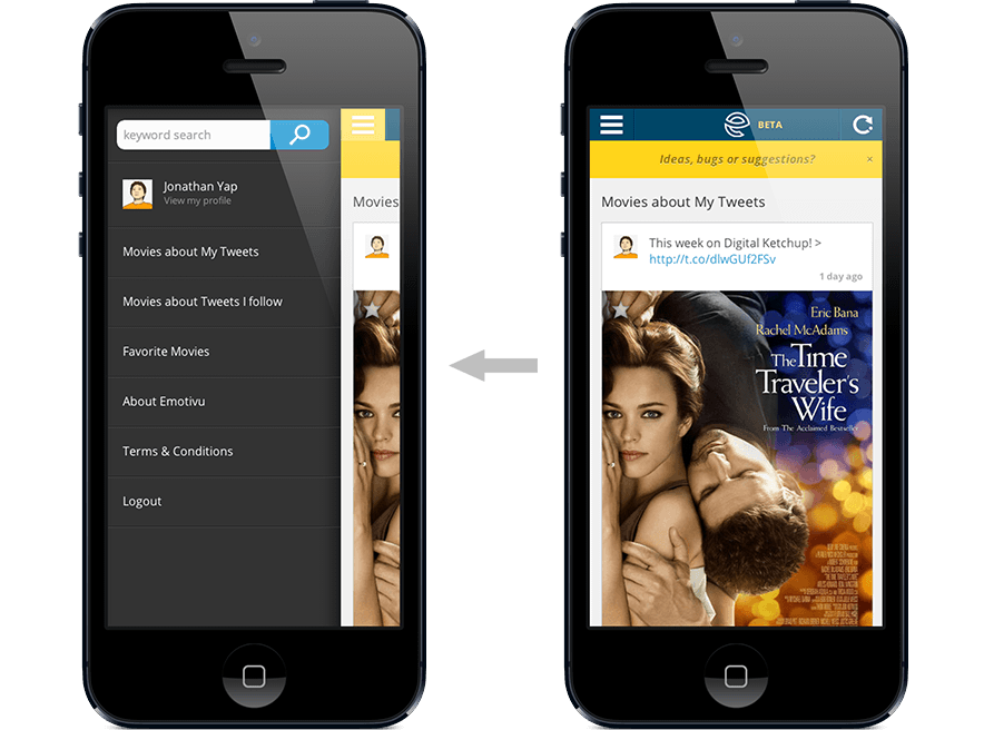
Emotivu was the result of Startup Weekend in 2012, an ambitious project that bring emotions, tweets, and movies together. Using sentiment analysis and a complex algorithm, Emotivu recommends you movies to watch based on your tweets. This was the initial proof of concept that slowly evolve over time.

1st version of Emotivu from Startup Weekend
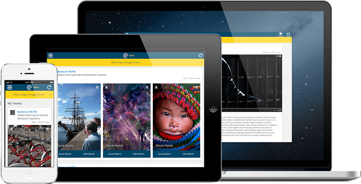
In a team of 3, my task was to focus on the design, experience and front end. One of my toughest challenge was making the app responsive, as it involves planning for cross browser and cross devices. This was one of my earliest entry into the full front end development.
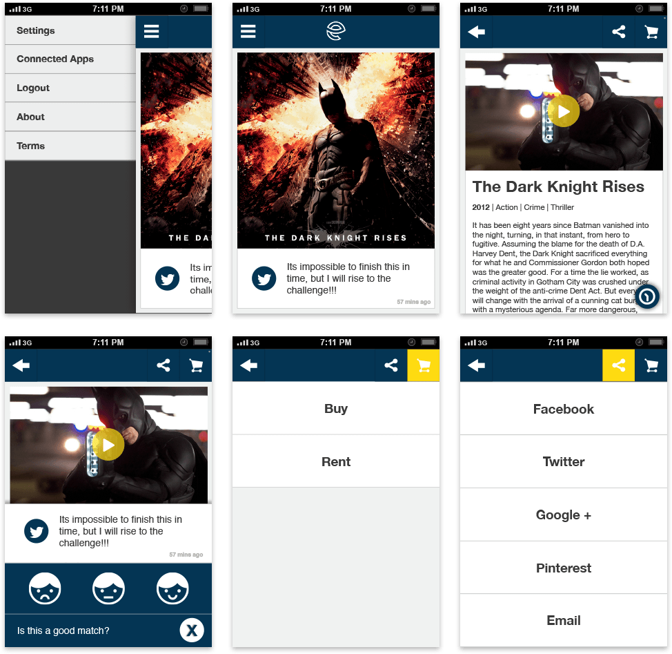
The user flow was vital in helping build the algorithm, as it requires a lot of user feedback to help it learn and improve recommendation and accuracy. We went through countless number of iteration to archive the right balance of feedback and usability.


Iteration on wireframe
The approach was designing in low-fi wireframes and getting the flow right, then jump into designing in browser. It was an challenging learning curve to adopt design in code fully within the workflow, but once settled, it felt awesome to see it come to life.
CSS animation was big. Big in terms of how well it performed over all browsers and devices. My target was to avoid using javascript to drive all the animation as it drops a huge amount of frame rates on mobile devices. CSS3 performed brilliantly across most devices, with devices that did not support it would simply gracefully degrade.
Web app responsive across devices
User feedback was vital in early development and shaping the direction. The team took the mindset of test fast, test often, so we took to the streets to interview people as to inform the design.
Our app is far from finish as we pressed on to work on getting Emotivu closer to how we pictured it. We manage to secure initial interest to funding but in the end, it was down to personal reasons that Emotivu did not take off. This has always been close to heart and highly regarded as the most intense period of my career growth.

