This is what happen when you mash up the light cycle game from Tron and Foursquare. The idea of Tronsquare first came at the Unlock London Hackathon and the following day it won in the category of Most Innovative Application.
The team then came together to mash out awesomeness and put everything in full swing. Consisting of myself, an iOS developer, an Android developer, a web developer and an end point server side developer, each of us worked on our strength to create a game worthy of the Grid. In an AGILE environment, I lead the UX/UI development in making the game itself worked before polishing the UI.
Our on going efforts in getting the prototype working has took us closer and closer to our vision.
Crafting the logotype
Aside from the logo itself, I created a logotype that will accompany the app icon, in application where the logo would not work as well on its on. It took some time and micro tweaking to get it to the way it should be without looking out of place.

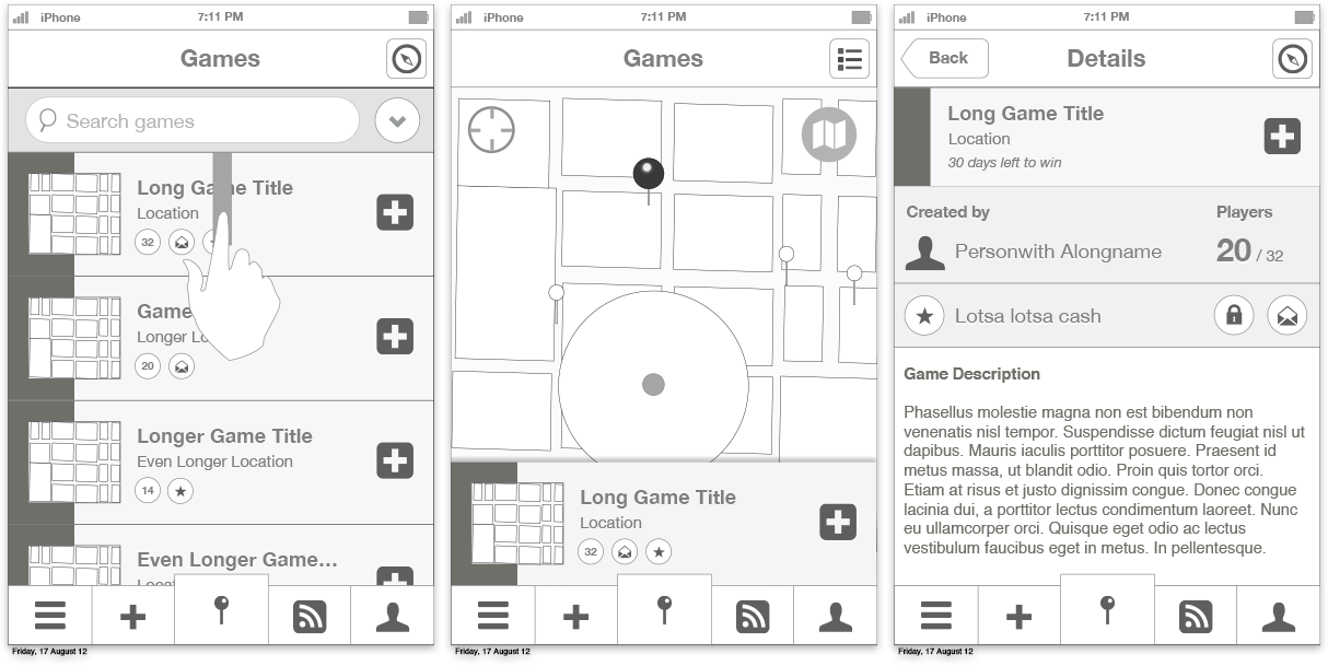
Walking through the user journey
Early wireframe did helped the team understand and improve the entire user journey. This helped us identify problems early on which helped on iterating features to include in roadmap.

We have kept the app simple and basic as our first prototype as our focus was to overcome a lot of development and technical challenges. This proved to be a challenge for myself in terms of the visual aspect.
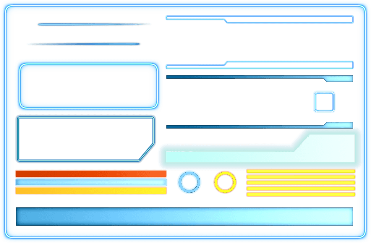
Developing the lighting UI
Getting the right colour and glow wasn’t easy. It took quite a lot of effort to get the consistency of light across the UI right. It is essential that the colour also add an element of interactivity and feedback to gamers. This was an opportunity to turn something basic to something that shared the similar aesthetic as the vision in the Grid.

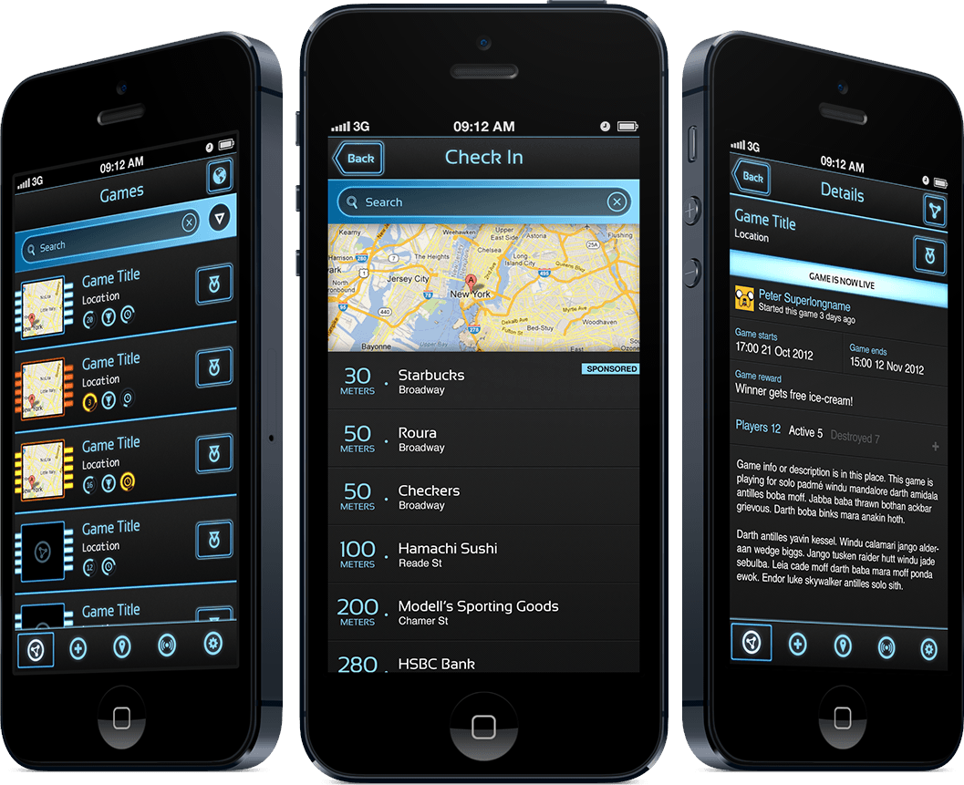
Tronsquare app
Finally the final outlook of the app, in all its pixel glory. It was given very high on aesthetic and intriguing concept as a feedback to most people we tested with. As this progress, I’ve learned a lot from working closely with engineers both on-site and remotely. The project did not progress beyond release due to not being able to solve some of the challenges faced in the back end.


