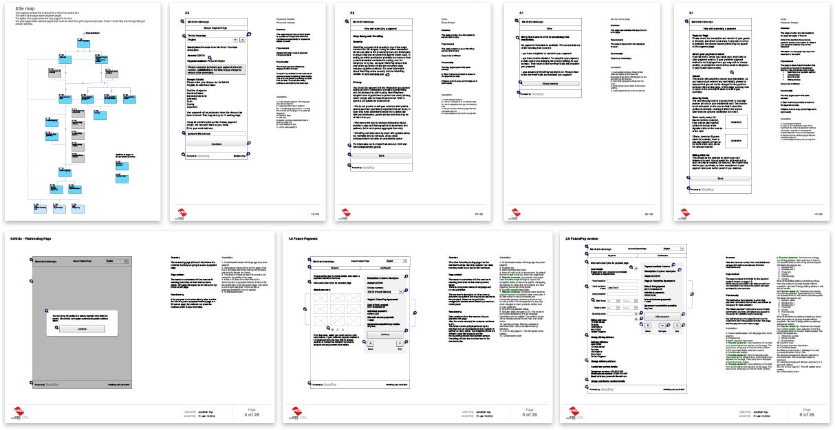
Worldpay’s payment platform is an easy solution for businesses online to allow customers to checkout. When this project came into light, mobile payment was starting to take off. This is about designing the end of a process rather than the start and getting customers over the last stage of a purchase. Working along side a UX designer and the client, we take a look at all the entry and possible scenario.

Preparing for the world of payments: low-fi wireframes
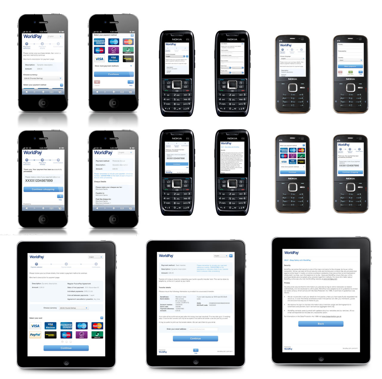
Working closely with the client, we identified the scope of devices that the client wish to support, their capabilities and their limitations. From tablet to high end smart phones to low end feature phones, each of their differences had to be documented.
I was in place to design the low end, tablet and no-js fall back options. It an interesting challenge, especially on the low end spectrum as there were more limitations to work around, such as the lack of touch interaction and the lack of native javascript support.
Covering the full range of devices
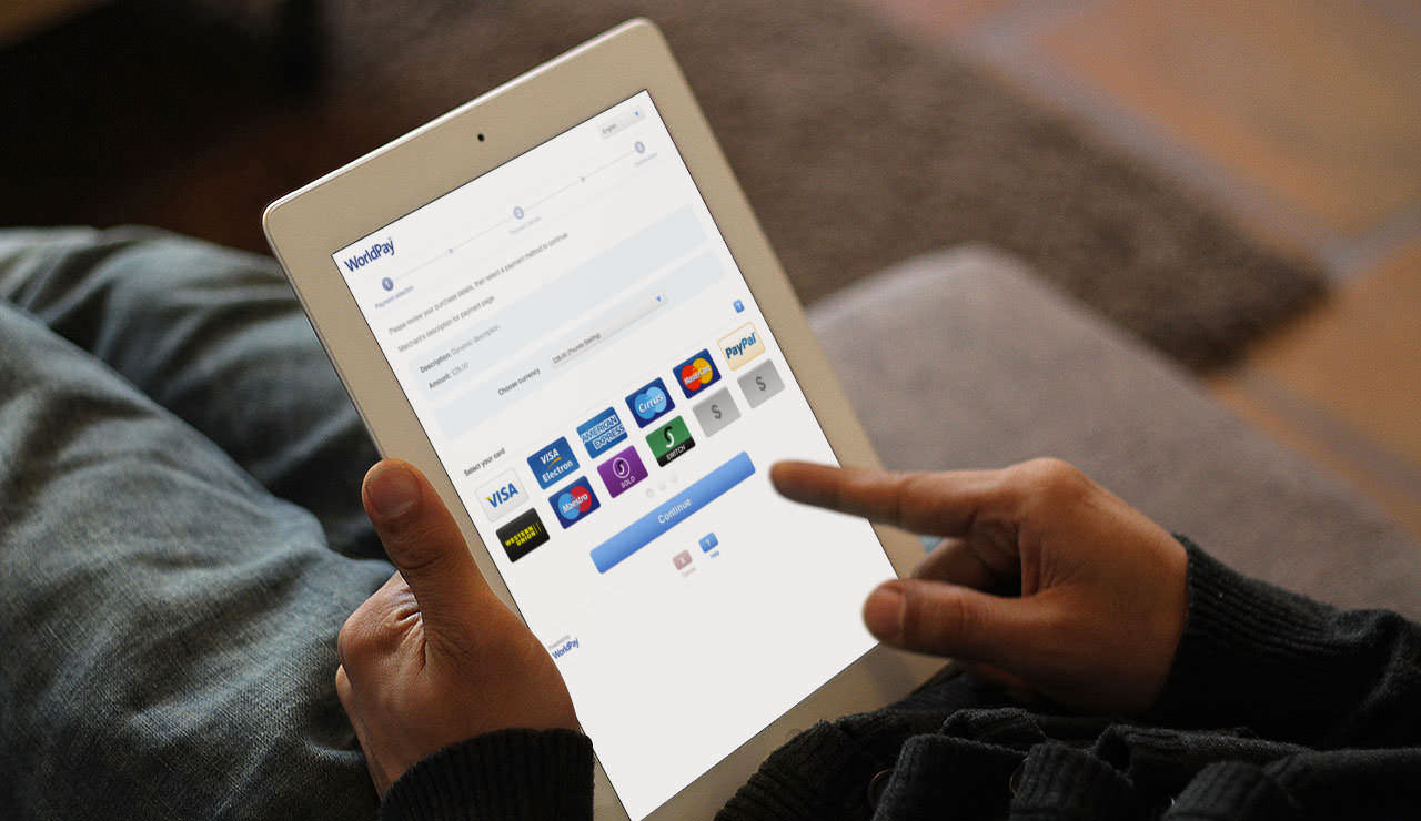
The designs were kept to a simple form. This provided the foundation for the payment process, yet also allowing businesses with a little more room to re-style it with their own brand.
In the end, we created a payment process that cover a wide range of devices but still share the same user journey.

A world of devices to support, a whole lot of considerations


