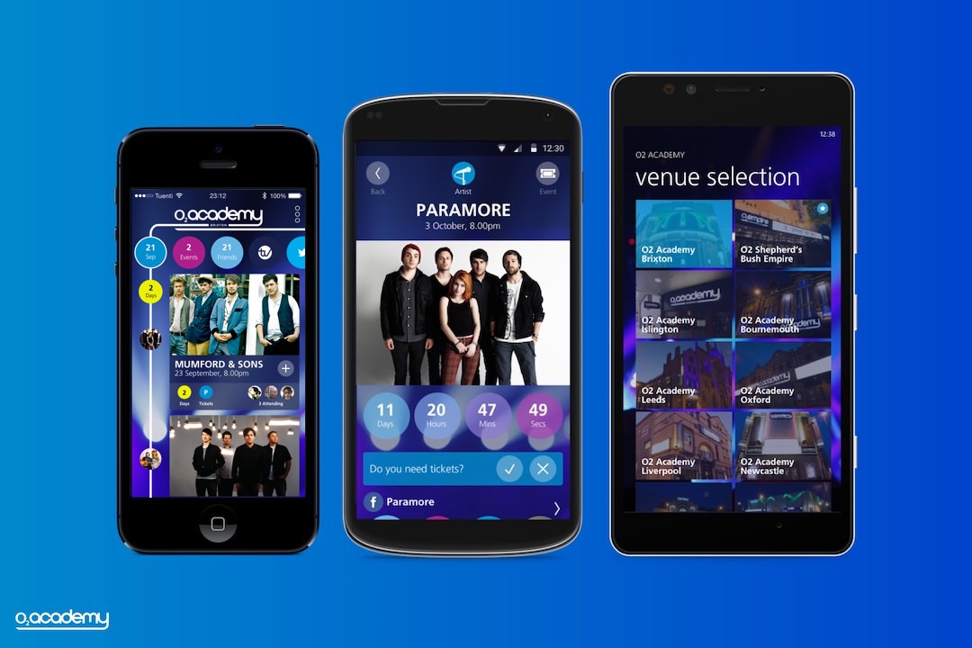
This project started out as a simple refresh in design and added functionality for both iOS and Android. It grew into an opportunity to add more value in the O2 music experience. This also helped us rethink the presentation method and a more engaging way to tell a story.
Initial UI refresh
The start of this project was to propose an improvement to the previous version and give it a much needed facelift to be inline with the O2 Academy brand. Purely visual design exercise, which later speaking to O2 Academy team, we manage to identify some ideas to innovate and revisit how people feel throughout the experience.
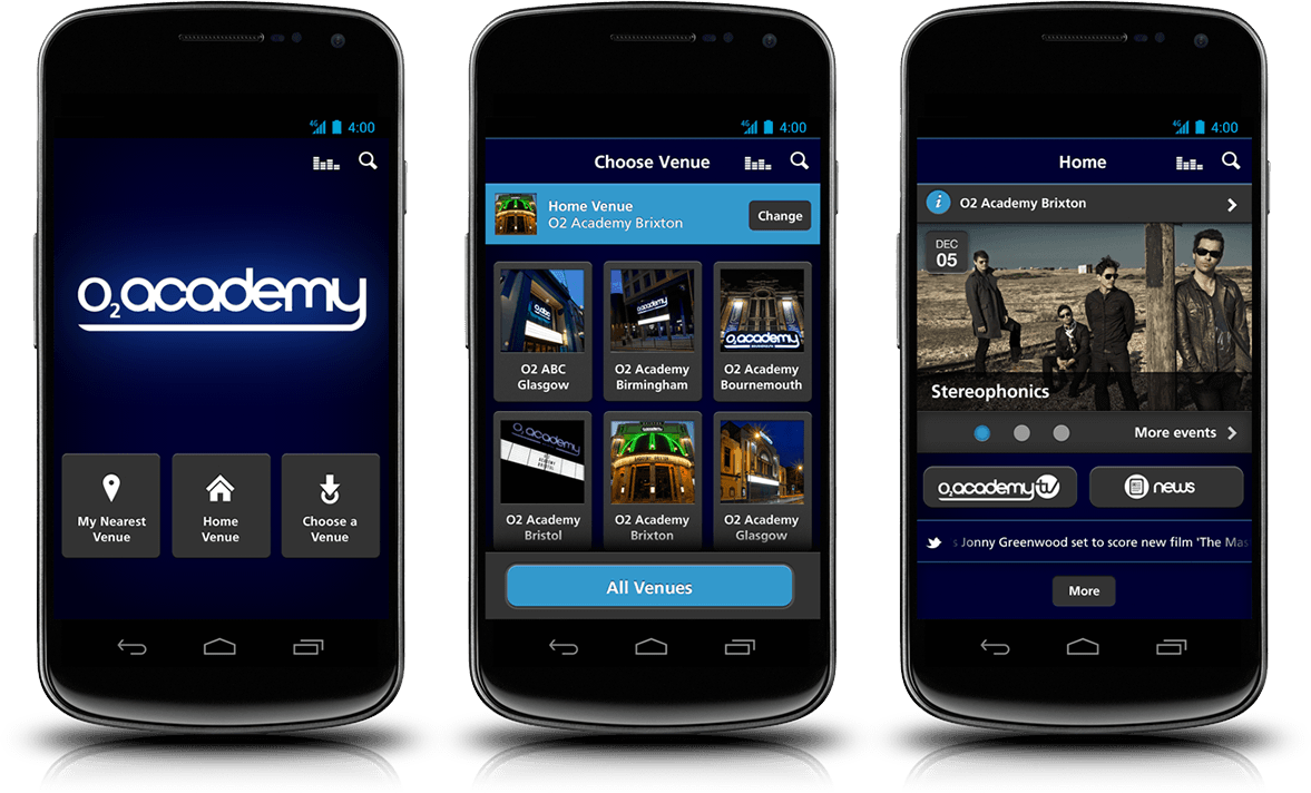
Departure of utilitarian to building up the entertaintment
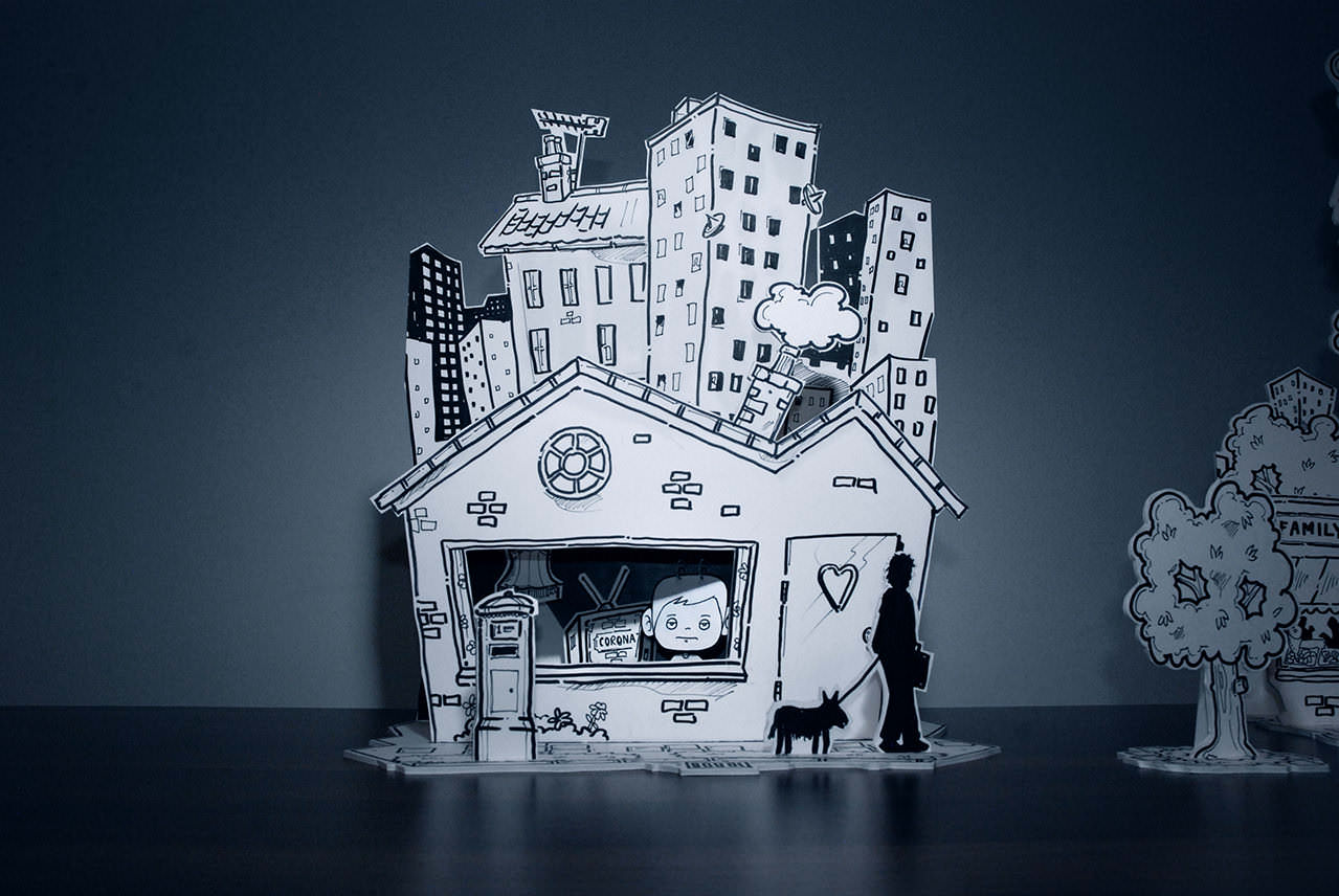
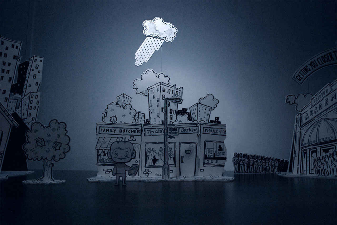
New direction, crafted story telling
Its about the journey from the excitement of getting the tickets to anticipation of attending the big day to the eagerness of finding the next gig. Every event is different and every artist is unique, so an adaptive approach to the app was introduced, making it about the experience that matter to people. We took this opportunity to present the idea in a different light, in the experience of the app.
User journey in play
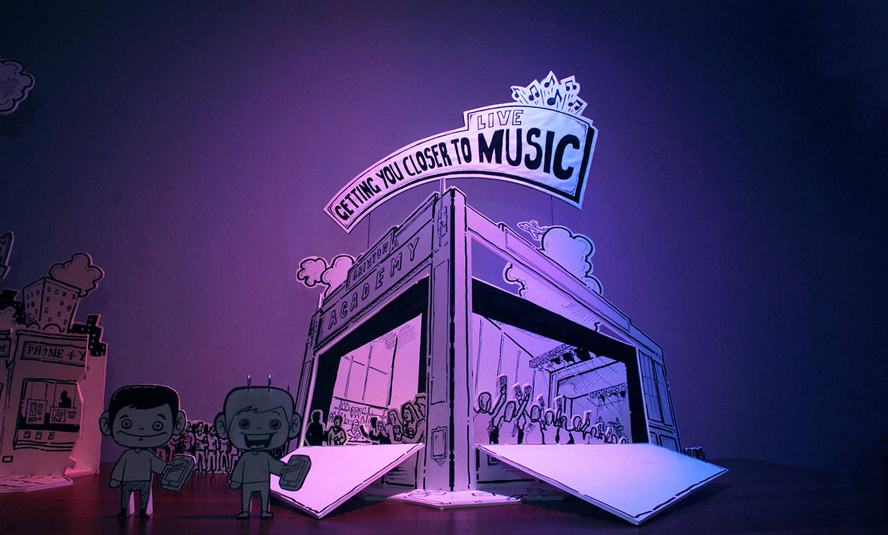
We constructed a set that mimics the event cycle and introduced elements that enhance the experience. Through the set, we were able to communicate an engaging story and paint a much clearer picture in an exciting way.
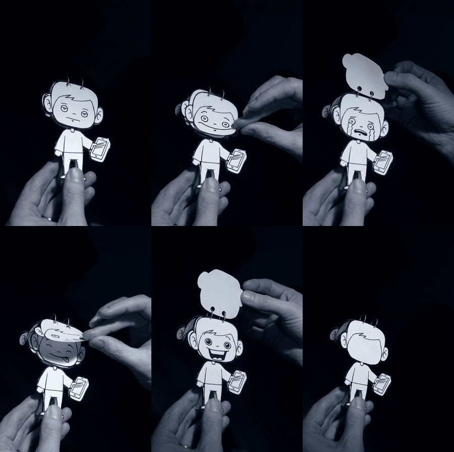
Persona and his moments
This really helped the client understand and engage in the idea of focusing on the people and experience. We were able to encourage a lot of healthy discussion through this little guy, putting the perspective of the user at the centre of the attention.
Introducing Bandpack
With the focus now on the people, the event and performer manifested itself to be a crucial aspect of the experience. So, we introduce an element called the Band Pack that allow artists to headline their own event. This allow the app to pull in customised content that tailors to the personality of the artist. We also provide a complete view by pulling in relevant information about the performing venue.
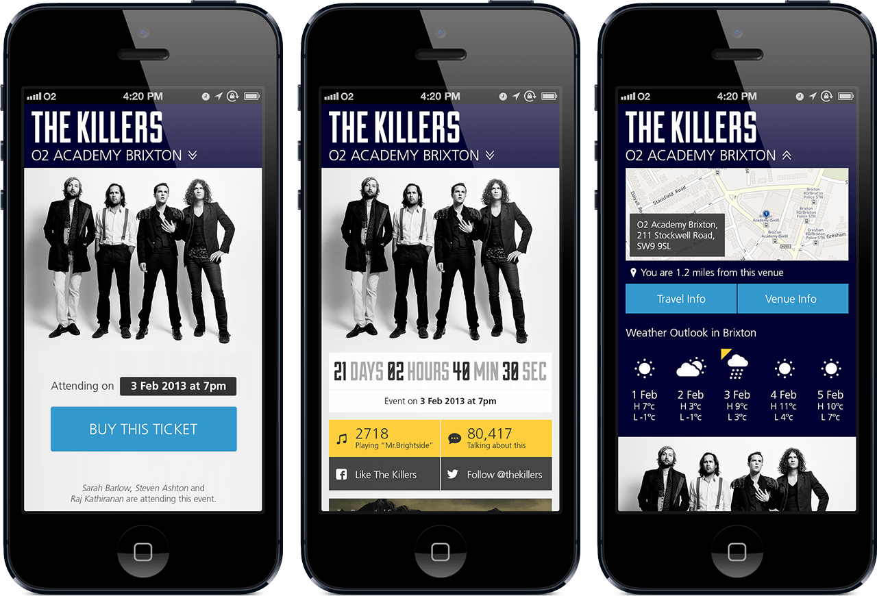
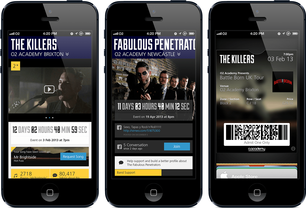
UI that is all about building up to the actual experience
This makes it easy to pull in information and invite friends to join up for a night of excitement. In conclusion, the idea is about bringing you closer to the music through mobile and we have successfully created the right conversation with the client while discovering a unique way to showcase ideas and creating discussion.
I saw project through to the successful launch of the app on iOS, Android, and Windows phone with a slight departure in visual but the core idea remains in the heart of the app experience.
